ROLE
PRODUCT DESIGNER
YEAR
2025
TOOLS
FIGMA, MIRO
DELIVERABLES
MOBILE APP PROTOTYPE, USER RESEARCH, TESTING & ITERATION
CONTENTS
OVERVIEW
THE PROBLEM
THE CURRENT MARKET
THE OPPORTUNITY
RESEARCH & DEVELOPMENT
KEY WORKFLOWS
TESTING & ITERATION
DESIGN SYSTEM
FINAL PRODUCT
NEXT STEPS
TAKEAWAYS


OVERVIEW
Finding productivity in relaxing, personal spaces.
3 side hustles, part-time school, and passion projects? Juggling competing priorities can be difficult. DWELL makes it easy to automate and compartmentalize your work while keeping you meditative, motivated, and relaxed.
(verb) to remain for a time, or to keep the attention directed.
Merriam-Webster Dictionary
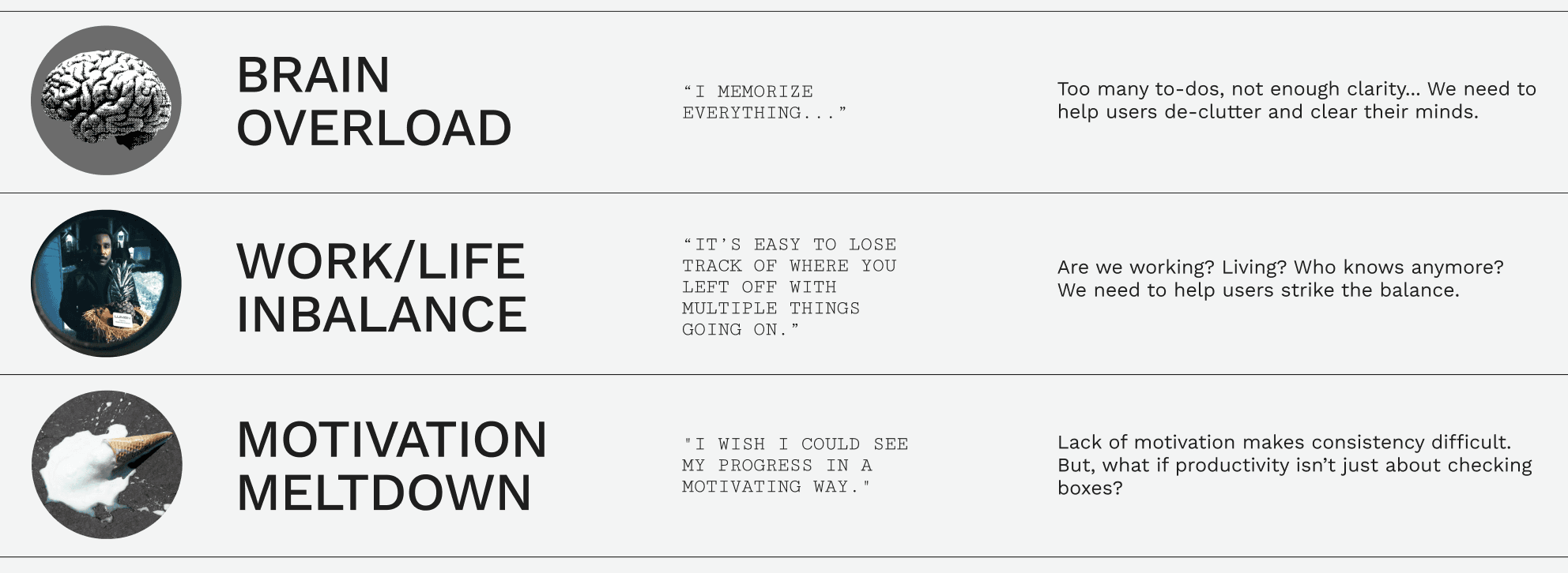
THE PROBLEM
Productivity burnout affects almost half of the working population.


*Quotes from user interviews.
THE CURRENT MARKET
How do productivity apps actually work?
A comparison of productivity apps showed me that there was a gap in tools that are powerful enough to handle heavy schedules, but intuitive and easy to use.


THE OPPORTUNITY
People expressed frustration with too many tools existing in their workflow…
and an overwhelming number of things to write down and remember where it was written, resulting in a loss of motivation.
So I thought…
there should be an automated, integrable,, and emotionally rewarding way to juggle multiple responsibilities and increase motivation.
And then I built…
a smart, multi-feature productivity app that feels simple, yet can automatically sort and create items, and is customizable to increase motivation and overall happiness.


RESEARCH & DEVELOPMENT
To understand productivity on a deeper level…
I asked people to walk me through their task organization, analyzed patterns in data from several articles and studies on motivation and burnout, and conducted an online survey with 20+ participants.
The end goal was to understand how people declutter and organize and find solutions to increase motivation and productivity. With gathered insights, I developed 3 user personas and 3 main user problems.
KEY QUESTIONS
What does being productive mean to you and how do you stay productive?
How do you juggle multiple priorities?
What keeps you motivated to complete tasks?
If you could have one magical tool today to help you with productivity, what would it be and why?

*Quotes from user interviews.


KEY WORKFLOWS
Based on the research, the next phase is building…
(1) A calendar for visual organization,
(2) Quick and easy task input and organization,
(3) A statistics and data visualizer to stimulate motivation,
(4) Tools that aid productivity,
(5) A simple but robust system and UI to reduce mental load.

(1) In-app integratable calendar.
The in-app calendar and date picker can be integrated with multiple accounts such as GoogleCal, Notion, iOS Cal, and more.
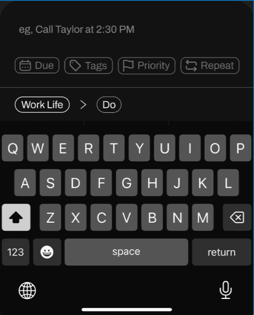
(2) Smart task input.
Users type commands and DWELL uses smart tasks and events to automatically creating schedules and sorting your things to do according to date, priority, tags, and more.

(3) Statistics and focus tracking.
The statistics feature gives users a bird's eye view of their accomplishments for users who care about progress and data.

(4) Focus tools.
The pomodoro tool is created mindfully with relaxing nature sounds and customizable colours to maximize emotional satisfaction.
(5) Clean spaces.
The focus space allows users to prioritize and organize different facets of their life.
Light and dark mode are available, of course.

TESTING & ITERATION
Based on the research, the next phase is building…
(a) a task management system.
I designed a system to help users create different task/event views and filters for ease of access through user testing, card sorting, and tree testing.

Hover over circles to see insights.
(b) an engaging and personalized onboarding experience.
This seamless, 3-step onboarding experience is focused on allowing users to directly interact with DWELL's features while learning about them.
STEP 1
STEP 2
STEP 3
High-fidelity onboarding user flow.

Onboarding user flow.

Low-fidelity wireframes.
DESIGN SYSTEM
Simple and clean design clears the mind.
Clean, lightweight design reduces clutter. A simple sans serif typeface improves clarity, and a light and dark mode offers personalization.

FINAL PRODUCT
Within 8 weeks, Dwell is born.
Built with 5 main features and user tested live through 1:1 video calls. Two more rounds of feedback led to this final iteration.

NEXT STEPS
What's next with DWELL?
Based on user feedback, these are features I would prioritize in order of importance and impact.

TAKEAWAYS
What I learned…
(1) Productivity isn't doing more, it's doing what matters.
I didn't want to create just another reminder app, I wanted to inspire motivation and evoke emotional satisfaction for people. I had empathetic conversations with chronic multitaskers and job jugglers, which helped me tap into the unconscious part of our brains that reveal how and why we might feel productive or not.
(2) Simplicity is strategic.
It's easy to throw in features, calendars, timers, trackers. But users don't need more tools; they need better ones. Simplicity doesn't mean less features—it just means removing unnecessary friction and making powerful tools effortless. A great productivity app should remove stress, not add to it. Designing simplicity is an act of care.
(3) Research should challenge assumptions, not just validate ideas.
Early in the design process, it's easy to fall in love with an idea and have confirmation biases. But the most valuable insights come from being proven wrong. Great design isn't about defending ideas—it's about evolving them! Every user insight should be a chance to refine, simplify, and rethink the experience for the better. 🌈

MOTUS

